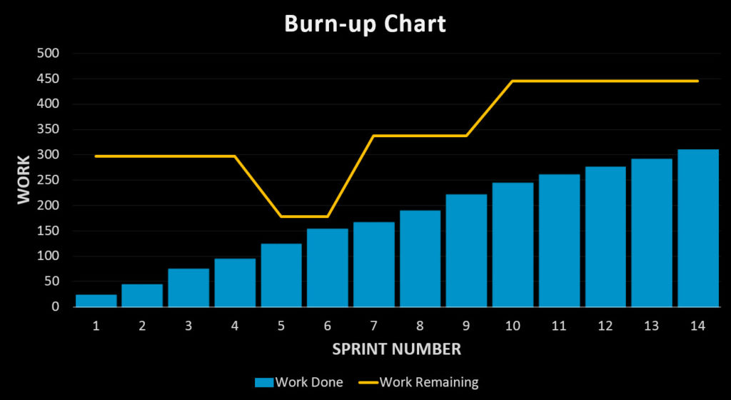
Scrum Teams commonly use Burn-up charts. They illustrate the gap between work done and work remaining. Scrum Teams use this to monitor their progress towards goals and to see the effects of scope creep on delivery dates.
What is a Burn-up Chart?
A burn-up chart is:
- A popular technique used by Scrum Teams
- Used to plot work done versus work remaining so we can assess how close we are to being finished
- Used to provide important information at a glance

Here’s one possible definition for the burn-up chart:
The burn-up chart shows
the amount of work done
versus
the amount of work remaining
at a given point in time
What is a Burn-up Chart used for?
A burn-up chart is useful for various reasons, including:
- Providing a visual representation on progress towards goals
- Show variations in the amount of work planned for the product and its effect upon delivery
- Explaining forecast delivery dates
The Scrum Guide requires Scrum Teams to inspect progress towards goals. While it is up to the Scrum Team to decide how to do this, the Scrum Guide offers us a hint and states ‘various practices exist to forecast progress, like burn-downs, burn-ups, or cumulative flows‘.
The Scrum Guide then clearly recognizes the benefits of burn-up charts. In addition, Scrum Teams commonly use them for measuring progress on the Sprint, the Release or the Product.
How Do You Create a Burn-up Chart?
To create a burn-up chart, we first decide on the measurement units for the axes:
- The horizontal axis shows time. In our case, we’re using Sprints
- The vertical axis shows work. In our case, we’re using Story Points
Next, we need to know:
- How much work was done in each time period
- How much work remained in each time period
Here’s the sample data I’ll be using for our chart:
We then plot two different data lines on the chart. One shows the cumulative amount of work done. The other shows the total amount of work remaining. The image at the top of this article shows you how this might look with the blue blocks showing cumulative amount of work done and the orange line showing total work remaining.
Why Should I Use A Burn-up Chart Rather Than Any Other Technique?
There are a few reasons why you might choose the burn-up chart over other options:
- By comparison, the burn down chart doesn’t provide any information on variances in amount of work for the product
- The cumulative flow diagram is more complicated to create and to interpret
- It provides a compelling view on where we are, when presenting to people outside the Scrum Team (ie: stakeholders)
Forecasting Delivery with the Burn up chart
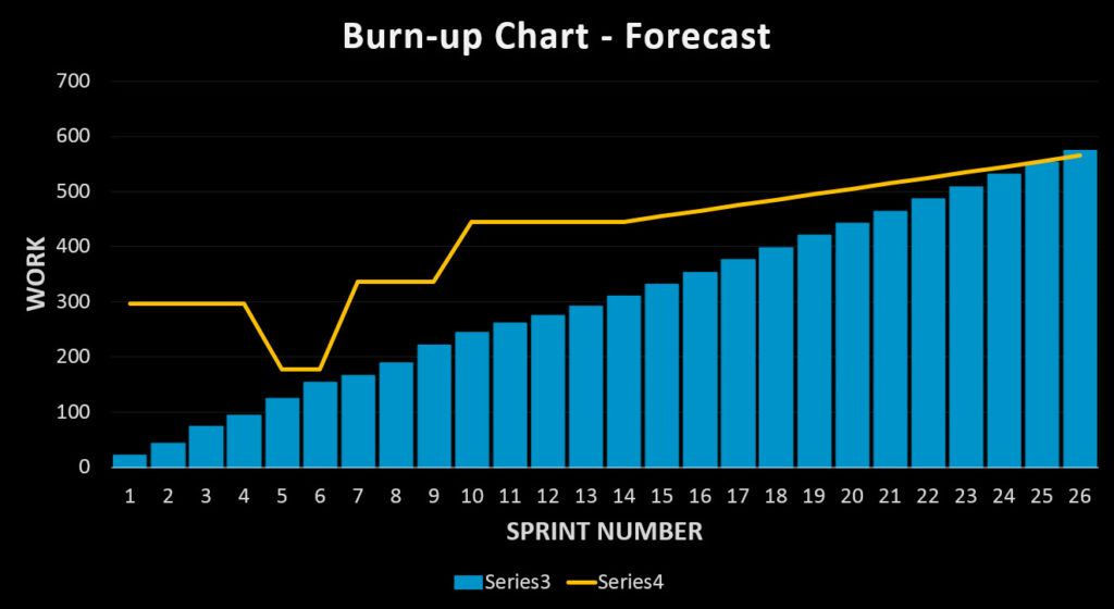
To create a forecast delivery date, we need to calculate the rate of change of the backlog (+10 story points per Sprint) and the average amount of work done each Sprint (22 story points). By extrapolating this data, we can forecast a delivery date in Sprint 26. Here’s how that might look:

Summary
Burn-up charts provide a lot of information. At a glance we can see:
- The amount of work done
- The amount of work remaining, and;
- The gap between these two points
From this, we can easily monitor scope creep and undesirable variances in work done and work remaining. The burn-up chart is also
- Quick and easy to create
- Readily consumed and understood
- Mentioned in the Scrum Guide
As a final benefit, the burn-up chart makes a great base for providing a forecast on when goals might be met.

Leave a Reply